
tidyverse是为数据科学设计的R软件包,它包含(ggplot2、dplyr、tidyr、stringr、magrittr、tibble)等一系列热门软件包。
本篇将介绍其中的ggplot2包。
tidyverse下载安装
install.packages("tidyverse")
library(tidyverse)
> library(tidyverse)
─ Attaching packages ─────────── tidyverse 1.3.0 ─
✓ ggplot2 3.3.2 ✓ purrr 0.3.4
✓ tibble 3.0.4 ✓ dplyr 1.0.2
✓ tidyr 1.1.2 ✓ stringr 1.4.0
✓ readr 1.4.0 ✓ forcats 0.5.0
─ Conflicts ──────────── tidyverse_conflicts() ─
x dplyr::filter() masks stats::filter() #filter和stats基础包中的filter函数冲突,覆盖掉基础包中的filter函数
x dplyr::lag() masks stats::lag() #lag和stats基础包中的lag函数冲突,覆盖掉基础包中的filter函数ggplot2有多种下载安装方法,可以直接install.package(“ggplot2”)、也可以install.package(“tidyverse”)
ggplot2是一个基于图形语法的声明式图形创建系统。您提供数据,告诉ggplot2如何将变量映射到美学,使用什么图形原语,然后由它来处理细节。
一个简单的例子介绍
在ggplot2中,图是采用串联起来(+)号函数创建的。每个函数修改属于自己的部分。
ggplot(data = mtcars,mapping = aes(x=wt,y=mpg))+
geom_point()+
labs(title = "Automobile Data",x="Weight",y="Miles Pert Gallon")
#第一行是固定的开始格式,使用ggplot函数指定了输入数据(data=),美学格式(mapping=aes 一般用于指定X轴、Y轴、分组、颜色、形状......)。aes代表aesthetics 即如何用视觉呈现信息
#第二行geom_point() 画出点图
#第三行labs()添加了注释,这里加了title标题、X轴标签、Y轴标签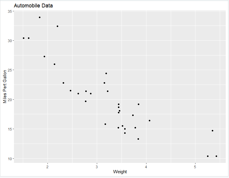
数据可视化的图形类型
根据数据集的不同,ggplot2提供不同的图形类型。ggplot2提供了以下数据结构的绘图方法:
- 一个变量-x :连续的或离散的
- 两个变量-x和y :连续和/或离散
- 连续双变量分布 – x和y (均为连续)
- 连续函数
- 误差棒
- 三个变量
对于每一种图形类型,ggplot2几乎都提供了geom()和对应的stat()。
例如:geom_density() 对应 stat_density()
一个变量:连续型
单连续型变量可绘制面积图、密度曲线图、点直方图、频率多边形图、直方图。
geom_area():创建面积图
ggplot(data = iris,mapping = aes(x=Sepal.Width))+
geom_area(mapping = aes(fill=Species),stat = "bin",alpha=0.6)+
theme_classic()

#注意:y轴默认为变量Sepal.Width的数量即count,如果y轴要显示密度,可用以下代码:
ggplot(data = iris,mapping = aes(x=Sepal.Width))+
geom_area(mapping = aes(fill=Species,y=..density..),stat = "bin",alpha=0.6)+
theme_classic()

#填充颜色fill
#透明度alpha
#统计方法stat
#选择主题theme_classic
可以通过修改不同属性如透明度(alpha)、填充颜色(fill)、大小、线型等自定义图形。
geom_density():创建密度图
ggplot(data = iris,mapping = aes(x=Petal.Length))+
geom_density(mapping = aes(color=Species,fill=Species),alpha=0.3)+
scale_fill_manual(values=c("#699995", "#E69F00","#656495"))+
scale_color_manual(values=c("#699995", "#E69F00","#656495"))+
theme_bw()
#透明度alpha
#自定义填充颜色scale_fill_manual
#自定义边线颜色scale_color_manual
#选择主题theme_bw
#注:stat_density()函数也有相同功能
geom_dotplot():点图
ggplot(data = iris,mapping = aes(x=Petal.Length))+
geom_dotplot(mapping = aes(fill=Species))+
theme_classic()
#填充颜色fill
#选择主题theme_classic
geom_freqpoly():频率多边形
ggplot(data = iris,mapping = aes(x=Petal.Length))+
geom_freqpoly(mapping = aes(color=Species,linetype=Species,y = ..density..))+
theme_minimal()
#线颜色color
#线类型linetype
#y轴取频率y = ..density..
#选择主题theme_minimal
#注:stat_bin()函数也有相同功能
geom_histogram():直方图
ggplot(data = iris,mapping = aes(x=Petal.Length))+
geom_histogram(mapping = aes(fill=Species),color="black",position = "dodge")

#指定不同Species用不同颜色 fill=Species
#指定所有边线全部使用black颜色 color="black"
#直方图摆放位置position
一个变量:离散型
geom_bar():条形图
ggplot(data=mpg,mapping = aes(x=fl))+
geom_bar(fill="steelblue",color="steelblue")+
theme_minimal()
#设置全部填充色fill
#设置全部线颜色color
两个变量:X,Y皆连续
geom_point():散点图
ggplot(data = iris,mapping = aes(x=Sepal.Length,y=Sepal.Width))+
geom_point(mapping = aes(shape=Species,color=Species))+
scale_color_manual(values = c("#999999", "#E69F00", "#56B4E9"))+
theme_minimal()
#指定按Species赋予不同形状和颜色 mapping = aes(shape=Species,color=Species)
#手动修改点颜色scale_color_manual
#指定主题theme_minimal()
geom_smooth():平滑线
ggplot(data = iris,mapping = aes(x=Sepal.Length,y=Sepal.Width))+
geom_point(mapping = aes(shape=Species,color=Species))+
geom_smooth(mapping = aes(color=Species),method = lm,se=TRUE)
#添加曲线geom_smooth
#method添加曲线方法,lm是线性模型
#se 置信区间
#另一相同功能的函数:stat_smooth()
geom_quantile():分位线
ggplot(data = iris,mapping = aes(x=Sepal.Length,y=Sepal.Width)) +
geom_point(mapping = aes(shape=Species,color=Species))+
geom_quantile()
#geom_quantile()增加分位点
geom_rug():边际地毯线
ggplot(data = iris,mapping = aes(x=Sepal.Length,y=Sepal.Width)) +
geom_point(mapping = aes(shape=Species,color=Species)) +
geom_rug()
#geom_rug在坐标系边界增加地毯图
geom_jitter():避免重叠
ggplot(data = iris,mapping = aes(x=Sepal.Length,y=Sepal.Width)) +
geom_point(mapping = aes(shape=Species,color=Species),position = "jitter")
或者
ggplot(data = iris,mapping = aes(x=Sepal.Length,y=Sepal.Width)) +
geom_jitter(mapping = aes(shape=Species,color=Species))
# 避免重叠 jitter
#可以使用函数position_jitter() 中的width 和width 参数来调整抖动的程度:width:x轴方向的抖动幅度、height:y轴方向的抖动幅度
geom_text():文本注释
ggplot(data = iris,mapping = aes(x=Sepal.Length,y=Sepal.Width)) +
geom_text(mapping = aes(label=rownames(iris)))
#用 geom_text 给每个点写上名字
两个变量:连续函数
geom_area():面积图
ggplot(economics, aes(x = date, y = unemploy))+
geom_area()
geom_line():折线图
ggplot(economics, aes(x = date, y = unemploy))+
geom_line()
geom_step(): 阶梯图
set.seed(1234)
ss <- economics[sample(1:nrow(economics), 20), ]
ggplot(ss, aes(x = date, y = unemploy)) + geom_step()
两个变量:x离散,y连续
ToothGrowth$dose <- as.factor(ToothGrowth$dose)
#提前数据处理,必要的准备工作
geom_boxplot(): 箱线图
ggplot(data=ToothGrowth,mapping = aes(x=dose,y=len))+
geom_boxplot(mapping = aes(fill=supp))
#多组的箱线图,每组中在根据supp拆分成多组来各自绘图
#另一相同功能的函数:stat_boxplot()
geom_violin():小提琴图
ggplot(data=ToothGrowth,mapping = aes(x=dose,y=len))+
geom_violin(mapping = aes(fill=dose,),alpha=0.6)+
geom_boxplot(width = 0.2,mapping = aes(fill=dose))
#小提琴图和箱线图结合
#依据dose分别绘制各组
#另一相同功能的函数:stat_ydensity()
geom_dotplot():点图
ggplot(data=ToothGrowth,mapping = aes(x=dose,y=len))+
geom_dotplot(binaxis = "y", stackdir = "center")
#binaxis打点分累依据x轴或者y轴
geom_bar(): 条形图
ggplot(data=ToothGrowth, mapping = aes(x = dose, y = len))+
geom_bar(stat = "identity",mapping = aes(fill=supp),position = "dodge")
#position参数有两种dodge、stack 分别表示不同的分组堆叠方式
两个变量:X,Y皆离散
ggplot(diamonds, aes(cut, color)) +
  geom_jitter(aes(color = cut), size = 0.5)
两个变量:绘制误差图
df <- ToothGrowth
df$dose <- as.factor(df$dose)
head(df)
#下面这个函数用来计算每组的均值以及标准误。
data_summary <- function(data, varname, grps){
require(plyr)
summary_func <- function(x, col){
c(mean = mean(x[[col]], na.rm=TRUE),
sd = sd(x[[col]], na.rm=TRUE))
}
data_sum<-ddply(data, grps, .fun=summary_func, varname)
data_sum <- rename(data_sum, c("mean" = varname))
return(data_sum)
}df2 <- data_summary(df, varname="len", grps= "dose")
# 将dose转换为因子型变量
df2$dose=as.factor(df2$dose)
head(df2)
df3 <- data_summary(df, varname="len", grps= c("supp", "dose"))
head(df3)f <- ggplot(df2, aes(x = dose, y = len, ymin = len-sd, ymax = len+sd))geom_crossbar():空心柱,上中下三线分别代表ymax、mean、ymin
ggplot(data=df2, mapping=aes(x = dose, y = len, ymin = len-sd, ymax = len+sd))+
geom_crossbar(mapping=aes(fill = dose)) +
scale_fill_manual(values = c("#999999", "#E69F00", "#56B4E9"))+
theme_minimal()
ggplot(data=df3, mapping=aes(x = dose, y = len, ymin = len-sd, ymax = len+sd))+
geom_crossbar(mapping=aes(color = supp),position = "dodge")

#position指定条图堆叠方法
#geom_crossbar()的一个替代方法是使用函数stat_summary()。在这种情况下,可以自动计算平均值和标准误。
geom_errorbar():误差棒
ggplot(data=df2, mapping=aes(x = dose, y = len,ymin = len-sd, ymax = len+sd))+
geom_bar(mapping=aes(color = dose), stat = "identity", fill ="white") +
geom_errorbar(mapping=aes(color = dose), width = 0.2)

ggplot(data=df2, mapping=aes(x = dose, y = len,ymin = len-sd, ymax = len+sd))+
geom_line(mapping=aes(group = 1)) +
geom_errorbar(mapping=aes(color = dose),width = 0.2)
geom_errorbarh():水平误差棒
#构造数据集df2
df2 <- data_summary(ToothGrowth, varname="len", grps = "dose")
df2$dose <- as.factor(df2$dose)
head(df2)
ggplot(data=df2,mapping = aes(y=dose,x=len,xmin=len-sd,xmax=len+sd))+
geom_errorbarh(mapping = aes(color=dose))geom_linerange():竖直误差线
ggplot(data=df2,mapping = aes(x=dose,y=len,ymin=len-sd,ymax=len+sd))+
geom_linerange()
geom_pointrange():中间为一点的误差线
ggplot(data=df2,mapping = aes(x=dose,y=len,ymin=len-sd,ymax=len+sd))+
geom_pointrange()
三个变量
#使用数据集mtcars,首先计算一个相关性矩阵。
df <- mtcars[, c(1,3,4,5,6,7)]
# 计算相关性矩阵
cormat <- round(cor(df),2)
require(reshape2)
cormat <- melt(cormat)
head(cormat)
在此基础上可添加的图层有:
- geom_tile(): 瓦片图
- geom_raster(): 光栅图,瓦片图的一种,只不过所有的tiles都是一样的大小
现在使用geom_tile()绘制相关性矩阵图。
# 计算相关性矩阵
cormat <- round(cor(df),2)
# 对相关性矩阵进行重新排序
hc <- hclust(as.dist(1-cormat)/2)
cormat.ord <- cormat[hc$order, hc$order]
# 获得矩阵的上三角
cormat.ord[lower.tri(cormat.ord)]<- NA
require(reshape2)
melted_cormat <- melt(cormat.ord, na.rm = TRUE)
# 绘制矩阵图
ggplot(data= melted_cormat, mapping=aes(Var2, Var1, fill = value))+
geom_tile(color = "white")+
scale_fill_gradient2(low = "blue", high = "red", mid = "white",midpoint = 0, limit = c(-1,1), space="Lab",name="Pearson\nCorrelation") +
theme_minimal()+
theme(axis.text.x = element_text(angle = 45, vjust = 1, size = 12, hjust = 1))+
coord_fixed()
图形元件
折线图(路径图)添加条带、矩形
# 折线图(路径图)
ggplot(data=economics, mapping=aes(date, unemploy))+
geom_path()

# 添加条带
ggplot(data=economics, mapping=aes(date, unemploy))+
geom_ribbon( mapping=aes(ymin = unemploy-900, ymax = unemploy+900),fill = "steelblue") +
geom_path(size = 0.8)

# 添加矩形
ggplot(data=economics, mapping=aes(date, unemploy))+
geom_rect( mapping=aes(xmin = as.Date('1980-01-01'), ymin = -Inf,xmax = as.Date('1985-01-01'), ymax = Inf),fill = "steelblue") +
geom_rect( mapping=aes(xmin = as.Date('2000-01-01'), ymin = -Inf,xmax = as.Date('2005-01-01'), ymax = Inf),fill = "grey") +
geom_path(size = 0.8)
在两个坐标点之间添加线段
# 绘制散点图
ggplot(data=mtcars, mapping=aes(wt, mpg)) +
geom_point()

# 添加线段
ggplot(data=mtcars, mapping=aes(wt, mpg)) +
geom_point() +
geom_segment(mapping=aes(x = 2, y = 15, xend = 3, yend = 15),color="red")

# 添加箭头
ggplot(data=mtcars, mapping=aes(wt, mpg)) +
geom_point() +
geom_segment( mapping=aes(x = 5, y = 30, xend = 3.5, yend = 25),arrow = arrow(length = unit(0.5, "cm")),color="steelblue")
在点之间添加曲线
#添加曲线
ggplot(data=mtcars, mapping=aes(wt, mpg)) +
geom_point() +
geom_curve(mapping=aes(x = 2, y = 15, xend = 3, yend = 15),size=1.2,color="red")
图形参数
图标题、轴标题和图例标题
图标题
+ggtitle(label = "main title",subtitle = "sub title")
#ggtitle函数可以在图上方增加主标题和副标题。

+labs(title = "main title",subtitle = "sub title",caption = "caption title")
#labs函数里title添加主标题、subtitle添加副标题、caption添加角标(图片右下角的)

+theme(plot.title = element_text(color="", size="", vjust="", hjust="",......) )
#修改主标题title的颜色、字体、大小、位置.......

+theme(plot.subtitle = element_text(color="", size="", vjust="", hjust="",......) )
#修改副标题subtitle的颜色、字体、大小、位置.......

+theme(plot.caption = element_text(color="", size="", vjust="", hjust="",......) )
#修改角标caption的颜色、字体、大小、位置.......
轴标题
+xlab("dose(mg)")
+ylab("tooth len(cm)")
#xlab、ylab 可以修改x轴、y轴标题

+labs(x="New X axis label",y="New Y axis label")
#labs函数里x、y也可以修改x轴、y轴标题

+theme(axis.title.x = element_text(color="", size="", vjust="", hjust="",angle =......),
       axis.title.y = element_text(color="", size="", vjust="", hjust="",angle =......))
#修改角标x轴标题、y轴标题的颜色、字体、大小、位置、角度.......
图例标题
+ labs(fill = "A vs B",color="0.5 VS 1 VS 2")
#labs里用分组的变量(fill、color)可以直接修改图例的标题名

+ theme(legend.position="top")
#theme 函数里使用legend.position 控制图例位置: "left","top", "right", "bottom", "none"
+ theme(legend.title = element_text(color="", size="", vjust="", hjust="",angle =......))
#修改图例标题的颜色、字体、大小、位置、角度.......
+ theme(legend.background = element_rect(color="",fill=""......))
#修改图例背景的填充颜色、边线颜色.......
主题theme
从上面两个例子可以看出,在ggplot2里我们一般用labs来控制各种文本信息(文本填写的内容)、用theme来控制这些文本的美学信息(颜色、位置、角度、大小、字体…)。theme通过“组件+功能”的方法来实现一系列的美学控制。
ggplot2包里有一些默认的theme主题,可以直接调用:
- theme_grey() 默认背景,浅灰色背景和白色网格线,无边框;
- theme_bw() 类似默认背景,调整为白色背景和浅灰色网格线,无边框;
- theme_linedraw() 白色背景和黑色网格线,黑色边框线;
- theme_light() 白色背景和浅灰色网格线,浅灰色边框;
- theme_dark() 灰黑色背景和灰色网格线,灰色/无边框;
- theme_minimal() 白色背景和浅灰色网格线,无边框;
- theme_classic() 类似R本身绘图的风格;
- theme_void() 完全空白
功能
如果想要自己细致的控制主题的某个组件,则需要使用“element_**()”函数。(可以在包里默认的主题上使用,即为“覆盖”默认主题的配置)
ggplot变量 + theme(组件 = element_功能(......))功能有4个基本类型,包括文字(text),线条(line),矩形(rectangle),空白(blank)。各有一系列控制外观的参数(部分常用的):
text
element_text() 对应标签和标题;其中参数包括:
- family = “字体名”| 字体
- colour = “颜色单词”| 颜色
- size = 数值 | 大小,单位是磅(point)
- hjust = 水平方向调整| [0,1]
- vjust = 竖直方向调整| [0,1]
- angle =旋转角度| [0,360]
- lineheight = 行高
- mergin =(t=数值, r=数值, b=数值, l=数值) | 控制字体周围边距,默认值为0,四个字母分别对应top、right、bottom和left。
ggplot变量 + theme(plot.title = element.text(……))    # 修改图标题的属性
ggplot变量 + theme(axis.title.x = element.text(……))  # 修改x轴标题的属性
ggplot变量 + theme(axis.text.x = element.text(……))   # 修改x轴标签的属性
##axis.title.x 是X轴的标签(名字)
##axis.text.x  是X轴的刻度条
line
element_line()绘制线条,参数有:
- colour = “颜色单词”| 颜色
- size = 数值 | 大小
- linetype = 类型 | 线条类型
- linewidth = 数值 | 线条宽度
ggplot变量 + theme(panel.grid.major = element.line(……)) # 修改网格线rect
element_rect()绘制背景矩形(图像整体外围的部分),具体参数有:
- fill = “颜色”| 矩形框的填充色
- colour = “颜色”| 矩形边框的线条颜色
- size = 数值 | 边框的粗细
- linetype = “类型 | 线条类型
ggplot变量 + theme(plot.background = element.rect(……)) # 修改背景矩形blank
element_blank() 不绘制任何东西,并取消相应组间的空间。
组件
此部分对应下面代码的 组件 部分。(此处只写了部分常用的)
ggplot变量 + theme(组件 = element_功能(......))图像组件
| 组件 | 对应的element_功能() | 描述 |
| plot.background | element_rect() | 图像背景 |
| plot.title | element_text() | 图像标题 |
| plot.margin | margin() | 图像边距 |
坐标轴组件
轴线处理
| 组件 | 对应的element_功能() | 描述 |
| axis.line | element_line() | 轴线 |
坐标轴标签
| 组件 | 对应的element_功能() | 描述 |
| axis.text | element_text() | 坐标轴标签 |
| axis.text.x | element_text() | x轴标签 |
| axis.text.y | element_text() | y轴标签 |
坐标轴标题
| 组件 | 对应的element_功能() | 描述 |
| axis.title | element_text() | 坐标轴标题 |
| axis.title.x | element_text() | x轴标题 |
| axis.title.y | element_text() | y轴标题 |
轴须组件
| 组件 | 对应的element_功能() | 描述 |
| axis.ticks | element.line() | 轴须标签 |
| axis.ticks.length | unit() | 轴须标签的长度 |
图例组件
首先其他guide_legend()或guide_colourbar()等函数也可以用来修改图例。
以及向legend.position\legend.direction\legend.justification\legend.box等属性控制图例在图像中的布局。
| 组件 | 对应的element_功能() | 描述 |
| legend.background | element_rect() | 图例背景 |
| legend.key | element_rect() | 图例符号背景 |
| legend.key.size | unit() | 图例符号大小 |
| legend.key.height | unit() | 图例符号高度 |
| legend.key.width | unit() | 图例符号宽度 |
| legend.margin | unit() | 图例边距 |
| legend.text | element_text() | 图例标签 |
| legend.text.align | 0-1 | 图例标签对齐(0=右,1=左) |
| legend.title | element_text() | 图例标题 |
| legend.title.align | 0-1 | 图例标题对齐(0=右,1=左) |
面板组件
对应控制图像的外观
| 组件 | 对应的element_功能() | 描述 |
| panel.background | element_rect() | 面板背景(数据下面) |
| panel.border | element_rect() | 面板边界(数据上面) |
| panel.grid.major | element_line() | 主网格线 |
| panel.grid.major.x | element_line() | 竖直主网格线 |
| panel.grid.major.y | element_line() | 水平主网格线 |
| panel.grid.minor | element_line() | 次网格线 |
| panel.grid.minor.x | element_line() | 竖直次网格线 |
| panel.grid.minor.y | element_line() | 水平次网格线 |
| aspect.ratio | 数值(m/n,两个整数) | 图像宽高比 |
自定义标尺scale
ggplot2包中的scale系列函数可用于对图层属性进行调整。
在图形美化阶段,我们可以通过修改标尺改善图形外观。标尺设置一般不会对数据产生影响,但坐标轴标尺除外。
library(tidyverse)
scalex <- ls("package:ggplot2", pattern="^scale.+")
length(scalex)
scalex <- scalex[grep("([^_]+_){2}.+", scalex)]
unique(gsub("(([^_]+_){2}).+","\\1***",scalex))

 [1] "scale_alpha_***"      "scale_color_***"      "scale_colour_***"     "scale_continuous_***"
 [5] "scale_discrete_***"   "scale_fill_***"       "scale_linetype_***"   "scale_linewidth_***"
 [9] "scale_shape_***"      "scale_size_***"       "scale_x_***"          "scale_y_***"
粗略的将scale函数分为这么几个大类。分别是:透明度、线条颜色颜色、连续变量、离散变量、填充色、线条类型、线条宽度、形状、大小、X轴和Y轴。
颜色标尺设置
ls("package:ggplot2", pattern="^scale_fill.+")连续型颜色标尺
先看看“continuous”的用法。对于数据为非因子型的填充色映射,ggplot2自动使用“continuous”类型颜色标尺表示连续颜色空间。如果要修改默认颜色就要使用scale_fill_continuous函数进行修改
......+ scale_colour_continuous(..., type = getOption("ggplot2.continuous.colour"))

......+ scale_fill_continuous(..., type = getOption("ggplot2.continuous.fill"))

......+ scale_colour_binned(..., type = getOption("ggplot2.binned.colour"))

......+ scale_fill_binned(..., type = getOption("ggplot2.binned.fill"))
离散(间断)型颜色标尺
如果数据是因子型的颜色映射,颜色标尺则是离散型的,修改标尺需要使用相应的离散型颜色标尺如scale_color_discrete
scale_colour_discrete(..., type = getOption("ggplot2.discrete.colour"))

scale_fill_discrete(..., type = getOption("ggplot2.discrete.fill"))
identity标尺
当您的数据已经缩放时,使用这组缩放,即它已经代表了ggplot2可以直接处理的美学值。除非您还提供所需的断点、标签和导向类型,否则这些标尺不会产生图例。
函数scale_color_identity()、scale_fill_identity()、scale _size_identity等处理比例名称中指定的美学:颜色、填充、大小等。但是,函数scale_color _identity和scale_fil_identity也有一个可选的美学参数,可用于通过单个函数调用定义颜色和填充美学映射。函数scale_discrete_identity()和scale_continues_identity()是通用量表,可以与通过美学论证提供的任何美学或美学集一起使用。
scale_colour_identity(..., guide = "none", aesthetics = "colour")

scale_fill_identity(..., guide = "none", aesthetics = "fill")

scale_shape_identity(..., guide = "none")

scale_linetype_identity(..., guide = "none")

scale_linewidth_identity(..., guide = "none")

scale_alpha_identity(..., guide = "none")

scale_size_identity(..., guide = "none")

scale_discrete_identity(aesthetics, ..., guide = "none")

scale_continuous_identity(aesthetics, ..., guide = "none")
坐标轴标尺设置
ls("package:ggplot2", pattern="^scale_x.+")这些函数最基本的是continuous和discrete两个,通过设置它们的参数可以实现其它函数的效果。
breaks, labels, limits参数
continuous和discrete坐标轴标尺设定函数中最常用的参数是breaks、labels和limits,分别用于设置刻度位置、刻度标签和坐标轴范围。
trans参数
连续数据的坐标轴可以设置trans参数,它应该是通过调用scales包的相应trans类型实现的,比如scales中有log10_trans,ggplot2中可以直接设置trans=’log10’,它其实就是scale_x_log10函数的效果
coord坐标轴
 ls("package:ggplot2",pattern = "coord")
 [1] "coord_cartesian"     "coord_equal"         "coord_fixed"         "coord_flip"
 [5] "coord_map"           "coord_munch"         "coord_polar"         "coord_quickmap"
 [9] "coord_sf"            "coord_trans"         "stat_sf_coordinates" "summarise_coord"
笛卡尔坐标系
coord_cartesian
笛卡尔坐标系是最常见的坐标系类型,在坐标系上限制数据范围会将图放大(就像你用放大镜看一样)。
注意:在前面使用标度函数来设置坐标轴范围时,会删除范围之外原始数据。会在造成拟合曲线发生变化。
例:
#画出整个原图:
ggplot(mtcars, aes(disp, wt)) +geom_point() +geom_smooth()

#使用scale_x_continuous,范围以外的点全部丢弃。只是用范围内的点,所以拟合出的曲线和原图不一样。
ggplot(mtcars, aes(disp, wt)) +geom_point() +geom_smooth()+ scale_x_continuous(limits = c(325, 500))

使用coord_cartesian,不改变数据,还是按照原图来绘制、计算,结果展示 只放大目标区域。
ggplot(mtcars, aes(disp, wt)) +geom_point() +geom_smooth()+ coord_cartesian(xlim = c(325, 500))
coord_fixed
coord_fixed 确保X轴和Y轴具有相同的标度,即保证在任何情况下坐标轴的纵横比不变
默认是 1:1(y:x) 即参数 ratio = 1,可以通过修改 ratio 参数的值来调整两者之间的比例。
ggplot(mtcars, aes(mpg, wt)) + geom_point()
ggplot(mtcars, aes(mpg, wt)) + geom_point()+ coord_fixed(ratio = 1)
ggplot(mtcars, aes(mpg, wt)) + geom_point()+coord_fixed(ratio = 5)
ggplot(mtcars, aes(mpg, wt)) + geom_point() + coord_fixed(ratio = 1/5)
ggplot(mtcars, aes(mpg, wt)) + geom_point()+ coord_fixed(xlim = c(15, 30))
coord_flip
默认情况下,坐标系以横轴为 x 轴,纵轴为 y 轴。对于某些情况下,想要对 x 轴与 y 轴进行翻转,可以使用 coord_flip。
ggplot(diamonds, aes(cut, price)) +geom_boxplot()
#对X轴Y轴进行翻转
ggplot(diamonds, aes(cut, price)) +geom_boxplot()  +coord_flip()
coord_trans
在前面的章节中,我们使用标度函数来对数据值进行转换后绘制,但是 coord_trans 的转换方式与其不同,它的转换发生在统计变换之后。
coord_trans 的转换会影响几何对象的形状,可能原本的直线在变换之后变成了曲线
dsamp <- diamonds[sample(nrow(diamonds), 1000),]
#原图
ggplot(dsamp, aes(carat, price)) + geom_point()

#A:在ggplot的mapping=aes中xy轴映射指定log10
ggplot(dsamp, aes(log10(carat), log10(price))) + geom_point()

#B:使用scale_x_log10()、scale_y_log10()函数
ggplot(dsamp, aes(carat, price)) +geom_point() +scale_x_log10() +scale_y_log10()

#C:使用coord_trans()函数
ggplot(dsamp, aes(carat, price)) +geom_point() +coord_trans(x = "log10", y = "log10")
虽然三种方式的图形是一样的,但是图 A 的坐标轴范围是根据转换后的值确定的。而图 B 保留了原始数据的坐标范围,图 C 的坐标轴之间的距离经过对数变换变换之后像是被拉扯过一样,前面的间距宽,后面的间距窄,但是数据还是原来的。
坐标轴变换与标度函数变换的区别是,标度函数的变换发生在统计计算之前,而坐标轴变换是发生在统计计算之后。
极坐标系
极坐标系最常用于绘制饼图,饼图其实就是极坐标下的堆叠条形图,还可以用于绘制雷达图(直线图)、玫瑰图(条形图)等
其中,theta 参数用于指定变换为角度的坐标轴,默认为 x 轴。
ggplot(mtcars, aes(x = "TYPE", fill = factor(cyl))) +geom_bar(width = 1)                            #单x变量柱状图
ggplot(mtcars, aes(x = "TYPE", fill = factor(cyl))) +geom_bar(width = 1) + coord_polar()            #没有意义
ggplot(mtcars, aes(x = "TYPE", fill = factor(cyl))) +geom_bar(width = 1) + coord_polar(theta = "y") #饼图

ggplot(mtcars, aes(x = factor(cyl),fill=factor(cyl))) +geom_bar(width = 1)                           #多x变量柱状图
ggplot(mtcars, aes(x = factor(cyl),fill=factor(cyl))) +geom_bar(width = 1) + coord_polar()           #饼图
ggplot(mtcars, aes(x = factor(cyl),fill=factor(cyl))) +geom_bar(width = 1) + coord_polar(theta = "y")#比例圈图
绘制百分比图
# 绘制百分比图
df <- data.frame(
  variable = c("does not resemble", "resembles"),
  value = c(20, 80)
)
ggplot(df, aes(x = "", y = value, fill = variable)) +
  geom_col(width = 1) +
  scale_fill_manual(values = c("red", "yellow")) +
  coord_polar("y", start = pi / 3) +
  labs(title = "Pac man")
刻面
分面的作用是在一个页面上自动放置多幅图像,它先将数据划分为多个不同的子集,然后分别将每个子数据集绘制到页面的小图形面板中。
ggplot2有两种分面:
- 网格型 facet_grid
- 封装型 facet_wrap
| 语法 | 结果 |
| facet_wrap(~var,ncol=n) | 将每个var水平排列成n列的独立图 |
| facet_wrap(~var,nrow=n) | 将每个var水平排列成n行的独立图 |
| facet_grid(rowvar~colvar) | rowvar和colvar组合的独立图,其中,rowvar表示行,colvar表示列 |
| facet_grid(rowvar~.) | 每个row水平的独立图,配置成一个单列 |
| facet_grid(.~colvar) | 每个col水平的独立图,配置成一个单行 |
data(singer,package="lattice")#调用singer数据框
ggplot(data=singer,mapping=aes(x=height))+geom_histogram()+facet_wrap(~voice.part,nrow = 4)
ggplot(data=singer,mapping=aes(x=height))+geom_histogram()+facet_wrap(~voice.part,ncol = 4)
data(Salaries,package = "carData")#调用Salaries数据框
ggplot(data=Salaries,mapping=aes(x=yrs.since.phd,y=salary,color=rank,shape=rank))+ geom_point()+ facet_grid(.~sex)#一个变量sex
ggplot(data=Salaries,mapping=aes(x=yrs.since.phd,y=salary,color=rank,shape=rank))+ geom_point()+ facet_grid(discipline~sex)#两个变量组合discipline、sex附件:ggplot2的一个快速查找工具
blog.biodatas.cn/wp-content/uploads/2024/07/ggplot2.pdf
Pingback:R语言入门基础 – MyBioDatas